Film Evaluations
Table of Contents
Methodology
I’ve written a detailed account of my methodology here. I created an idealized digital test target with zones from (roughly) 0 to X, in one-step increments. I then meter on Zone V with a Pentax Spotmeter V, and shoot several frames both under- and over-exposed for the indicated exposure index.
Ilford FP4 plus
Summary
Easily my favorite film, FP4 plus shows very fine grain, good contrast, and a lot of latitude. It also pushes well up to at least ISO 500.
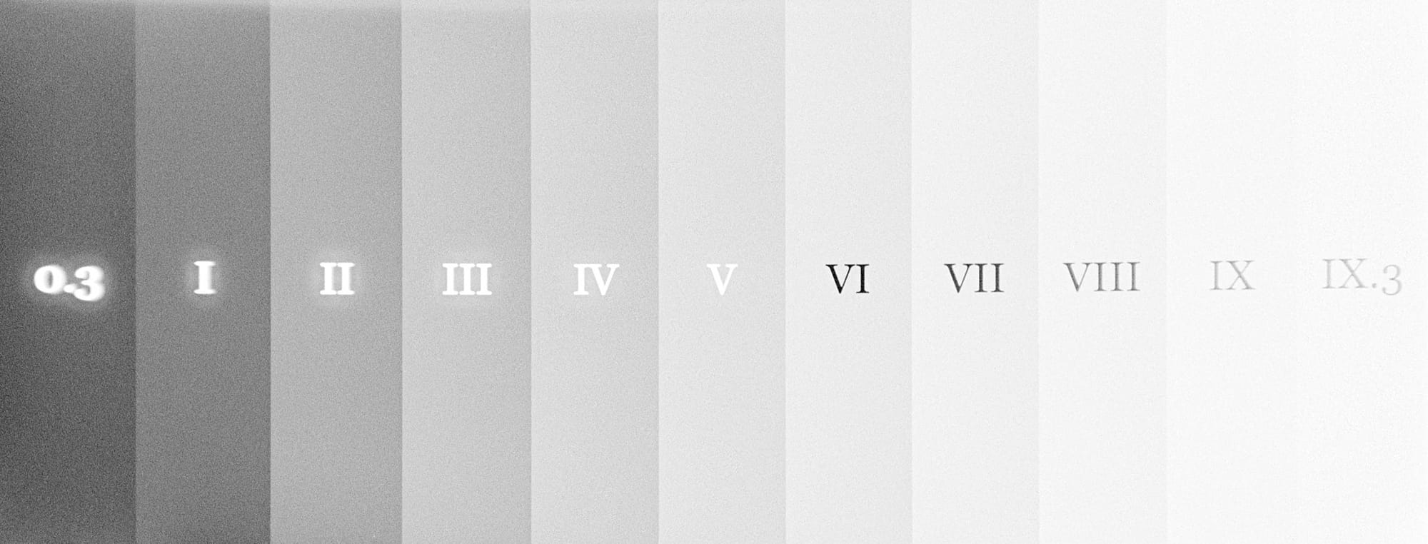
EI 500
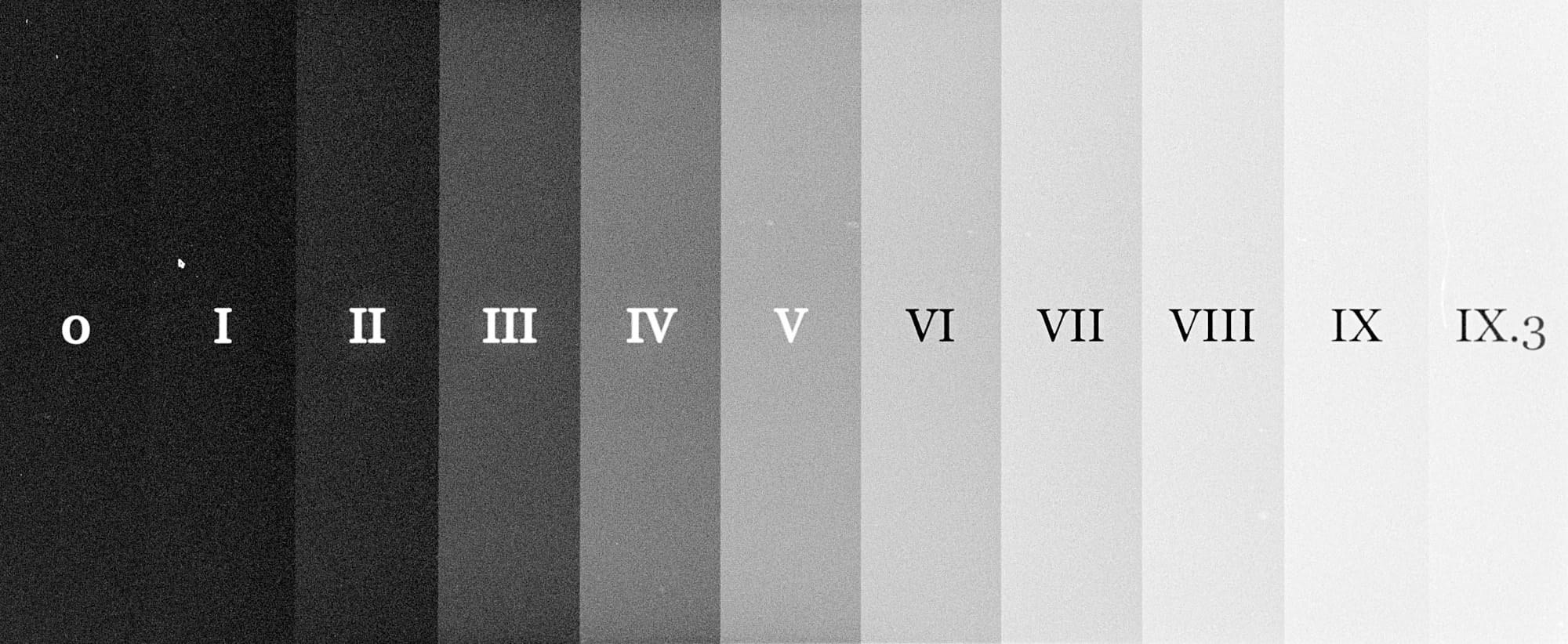
This is really the limit for FP4+. At ISO 500, we see very high contrast (𝛾=1.85), with a significant (2 stops) loss of shadow detail, and perhaps some loss of highlight detail—the dynamic range of the film has been reduced to about 7–8 stops. If you like the combination of fine grain with crunchy contrast—and I do—then this is an acceptable loss. If you need full dynamic range and smooth tonality, look elsewhere.
Development
Push/Pull: +2
Developer: Adox XT-3
Dilution: 1+1
Temperature: 20º
Time: 14'30"
Agitation: intermittent
Notes: Sent through the carry-on X-ray machine at LIS airport.
Digital Characteristic Chart
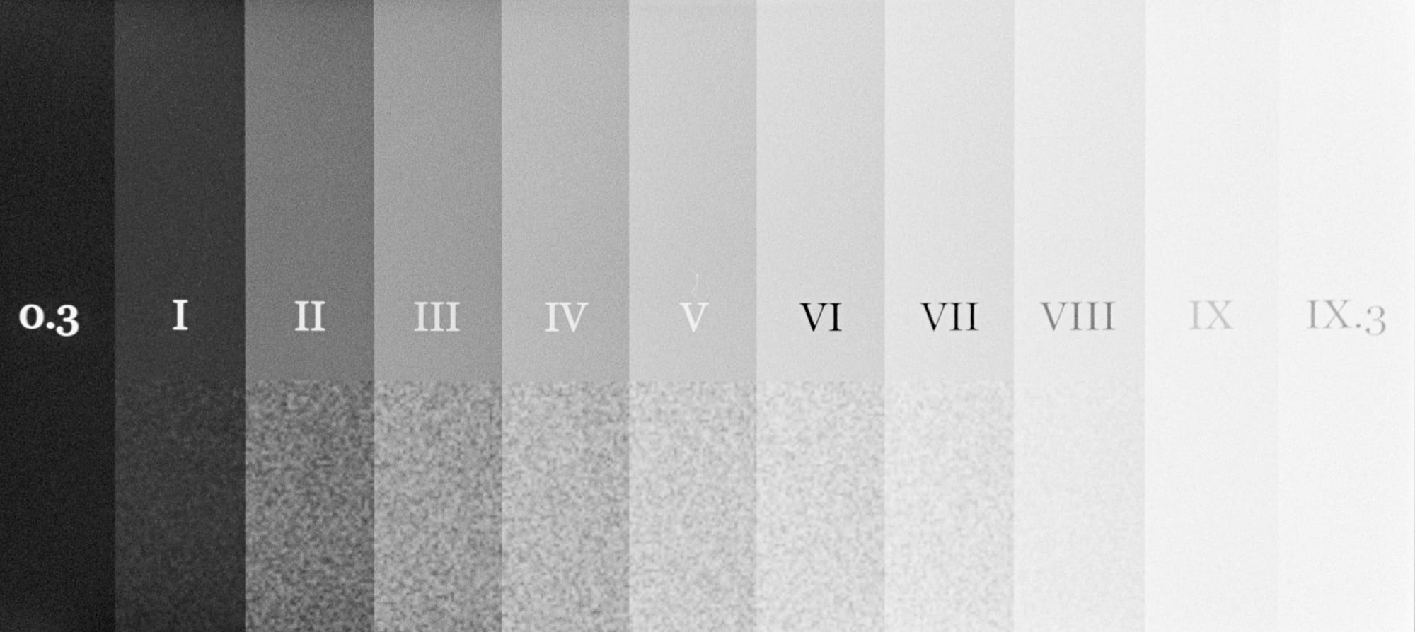
Test Targets
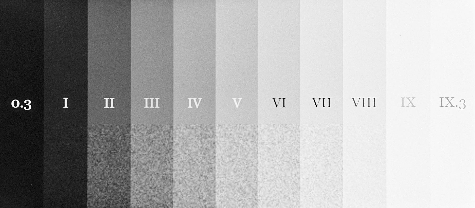
Left to Right: Metered @ ISO 125, 250, 500
AgfaPhoto APX400
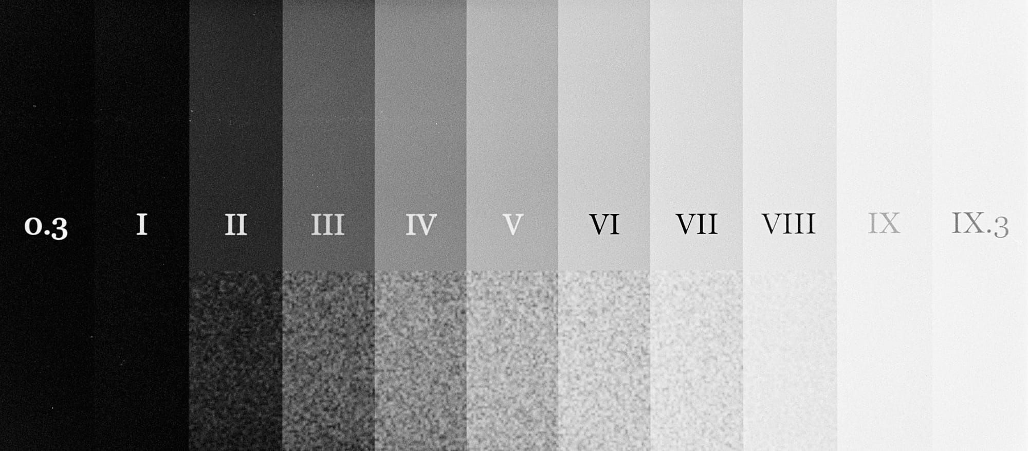
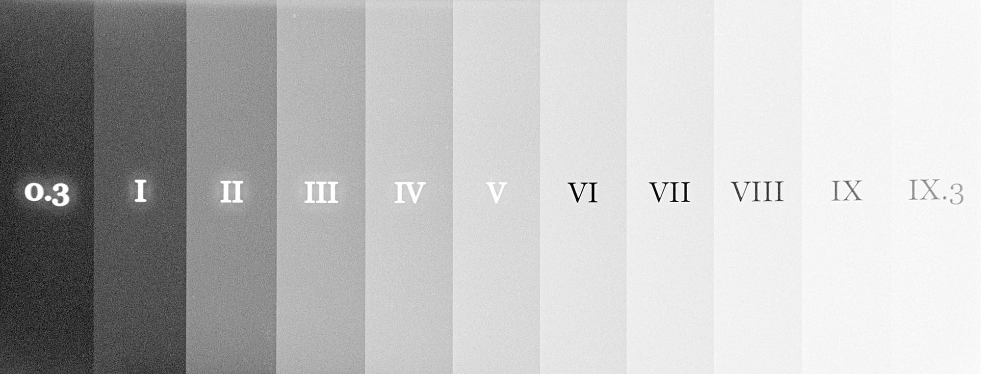
EI 800
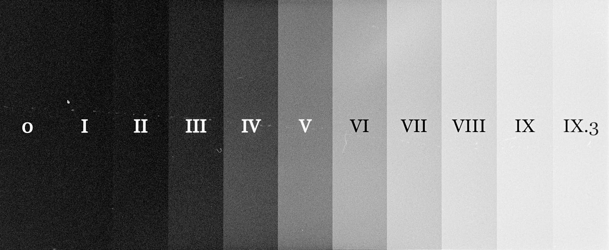
Given my development technique, I can easily rate this film at ISO 800 without additional development time. So, I meter at EI 800, but develop according to the time for EI 400. At 800, we see slightly increased contrast (𝛾=1.15), with nice definition in the highlights, and just a slight loss of the darkest shadow details.
Development
Push/Pull: +0
Developer: Adox XT-3
Dilution: 1+1
Temperature: 20º
Time: 12'
Agitation: intermittent
Digital Characteristic Chart
Test Targets
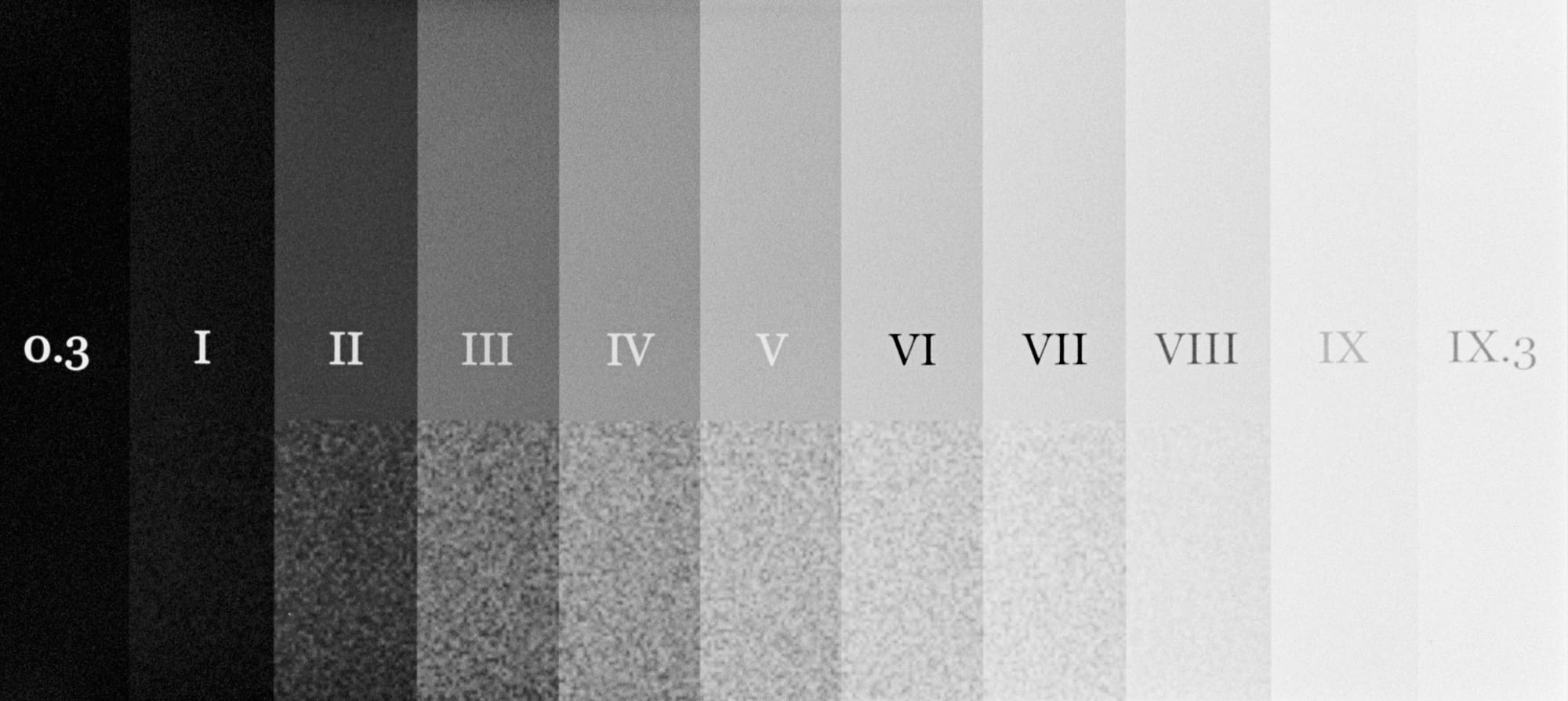
Left to Right: Metered @ ISO 200, 400, 800
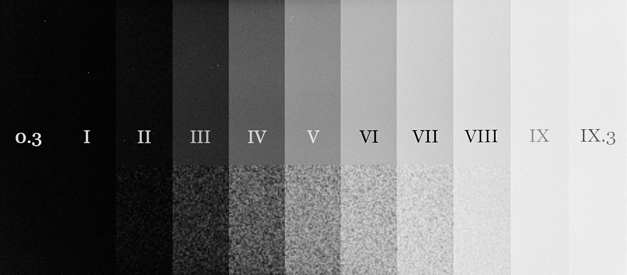
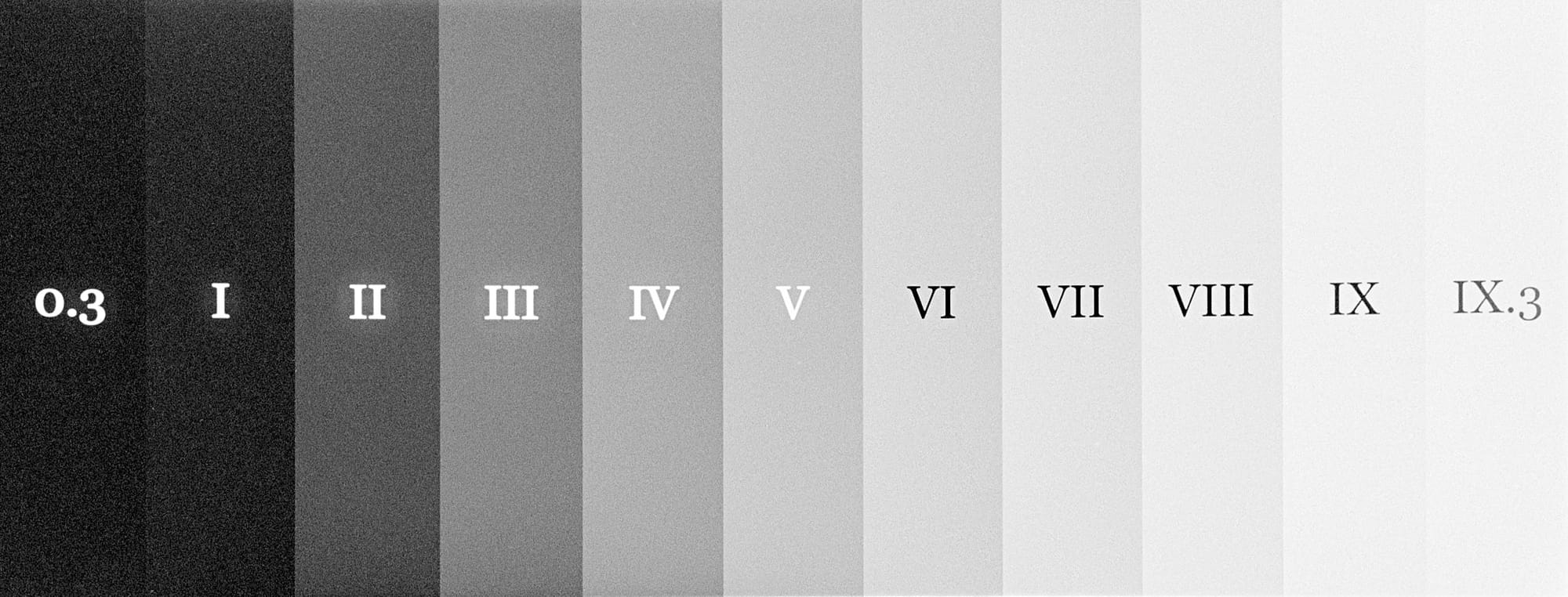
EI 1600
With only a single stop push in development, I can shoot this film at 1600, or anyway very close to it. So, I meter at EI 1600, but develop according to the time for EI 800. At 1600, we see notably increased contrast (𝛾=1.55), but still with good definition in the highlights, and about one stop of loss of the darkest shadow details.
Development
Push/Pull: +1
Developer: Adox XT-3
Dilution: 1+1
Temperature: 22,1º (It’s summer in Lisboa…)
Time: 11'45"
Agitation: intermittent
Digital Characteristic Chart
Test Targets
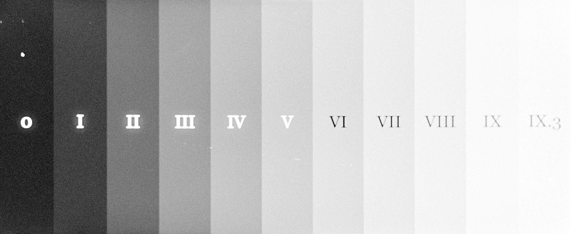
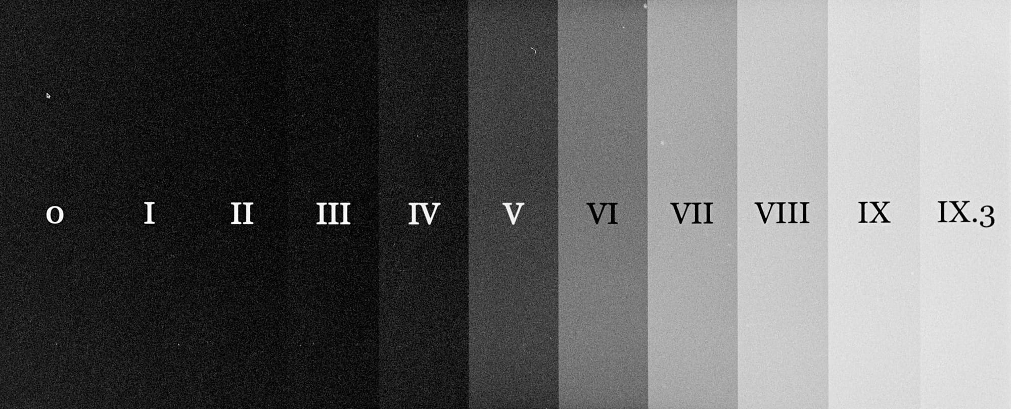
Top Left to Bottom Right: Metered @ ISO 400, 800, 1600, 3200, 6400
Kodak Double-X (5222)
Summary
Nominally an ISO 250 film, Kodak informs us it can be shot from ISO 50 to 1600 with suitable adjustment in development.
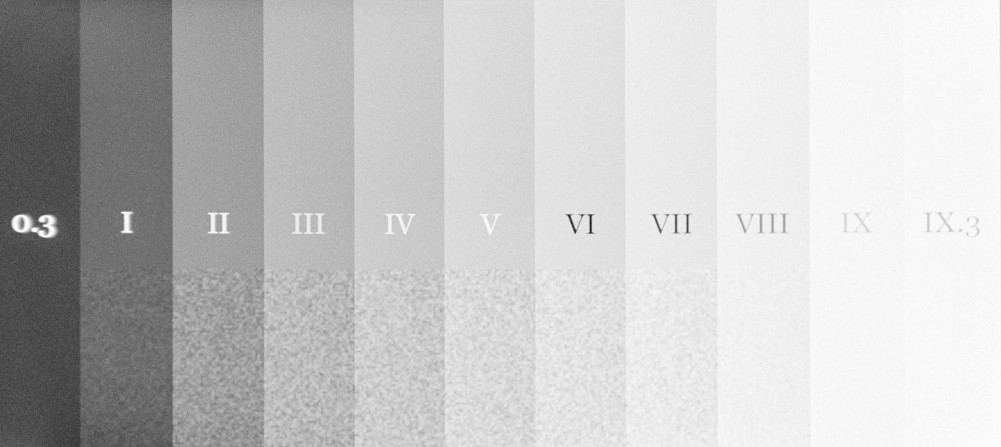
EI 500
Initial experiments reveal that I would rate this film at ISO 500 with normal development. It shows good tonal separation in the midtones (𝛾=0.99) at ISO 500 with lots of room for shadow detail, but the highlights can be flat.
Development
Push/Pull: +0
Developer: Adox XT-3
Dilution: 1+1
Temperature: 20º
Time: 10'
Agitation: intermittent
Digital Characteristic Chart
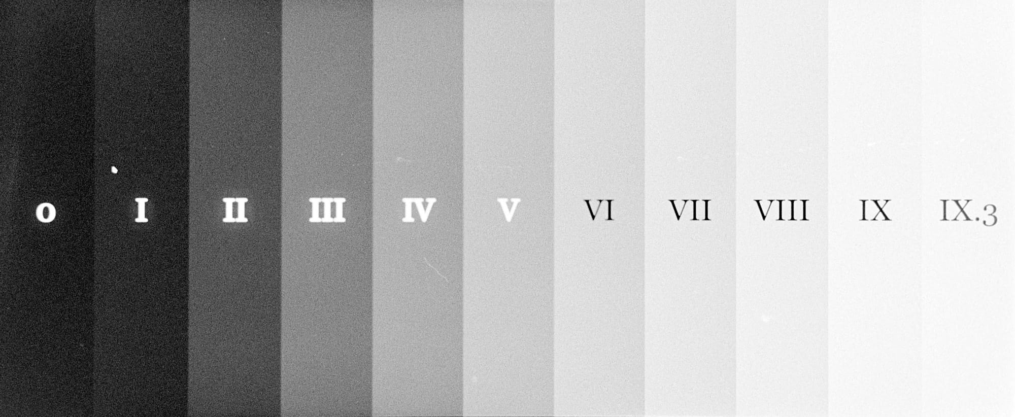
Test Targets
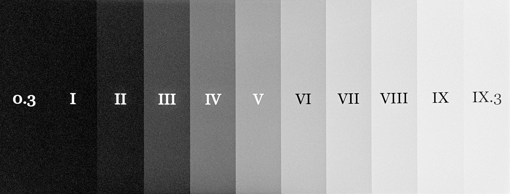
From Top Left: Metered @ ISO 75, 125, 250, 500, 1000
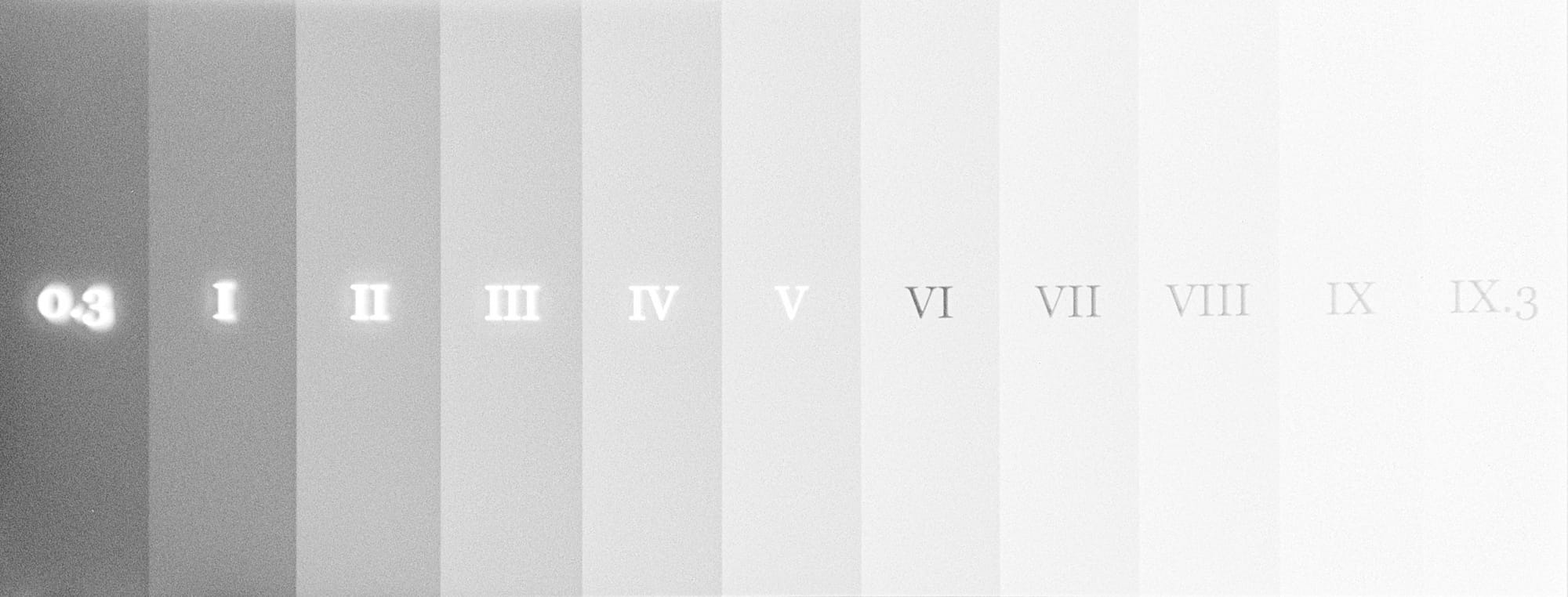
How to read the charts
Here is a sample digital characteristic curve chart showing how a fictional film responds to light.
Along the X-axis we have a measure of the brightness of an object using the Zone System, with Zone V representing an object metered as medium gray. Each zone is one stop brighter than the zone to it’s left, and one stop darker than the zone to it’s right.
Along the Y-axis is the film’s response to object brightness (inverted in the case of negative film) on my computer screen, with 0 representing darkest black and 255 representing absolute white.
The chart relates how a transparent a film is versus the brightness of the object being recorded. It has three interesting parts.
The toe is the part of the chart from about Zone 0 to Zone III—the shadows.
- How dark does the film get? If it doesn’t get very dark, then maybe we have overexposed the film.
- Is there a clear change from zone to zone? If there isn’t then maybe we have underexposed the film.
- How steep is the line? The steeper the line, the more contrasty the shadows are, and the better the film’s ability to distinguish shadow details.
The shoulder is the part of the chart from about Zone VII to Zone X—the highlights.
- How flat is the curve here? The flatter the curve, the less highlight detail will be recorded.
- Where does the curve begin to really flatten? This represents the maximum brightness the film can record, and is the point at which we can estimate the overall dynamic range of the film (the maximum number of stops that can be recorded). Most film will show 8–10 stops of dynamic range, that is, will flatten severely between Zone VIII or Zone X.
The straight-line portion is the part where most of a photo’s detail lies, representing middle tones between about Zone III and Zone VII.
- How steep is the curve here? This is generally where we rate a film’s overall contrast, because this is where we will notice it most. The slope of the curve here is called the gamma (𝛾), and is measured in the series labels for the chart.
On interpreting gamma. Because we are looking at a computer display’s rendering of film, rather than measuring it with a densitometer directly, the gamma values here have no real relationship to what’s printed in the datasheet for a given film. Instead, I’ve chosen to normalize the values so that a gamma of 1.0 precisely matches the gamma of my display. 𝛾 > 1.0 represent films with a higher contrast than my display, and 𝛾 < 1.0 represent films with a lower contrast than my display.
Put slightly differently, we might classify films with a 𝛾 > 1.0 as high contrast, and those with 𝛾 < 1.0 as low contrast. But this classification is arbitrary and subjective. Use your own judgment!